Tytec
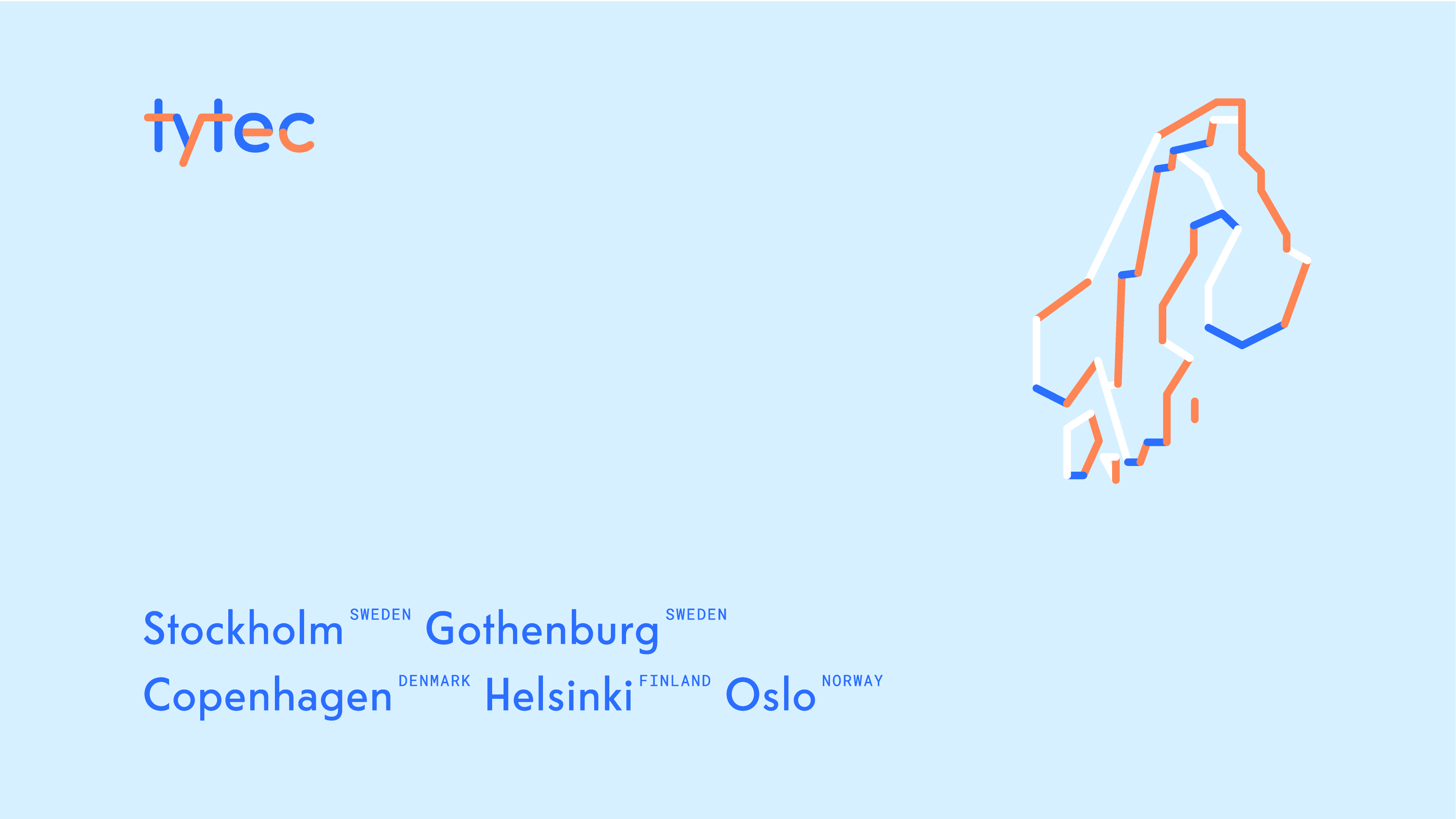
Tytec is a Scandinavian company which designs and builds advanced networking systems, focusing on data safety and data transmission speed. The company needed a new, outstanding and professional visual communication.
In spring 2017 we were honoured to design Tytec’s brand identity. The company gave us a lot of creative freedom. We love technology, but we know that miles of wires and tons of routers and sockets don’t have the best connotations. We wanted to find and emphasise only the best associations in the new visual communication.
In spring 2017 we were honoured to design Tytec’s brand identity. The company gave us a lot of creative freedom. We love technology, but we know that miles of wires and tons of routers and sockets don’t have the best connotations. We wanted to find and emphasise only the best associations in the new visual communication.
Scope
Branding, Web design, Web development, Print
Input
The company needed to change its brand identity and improve the quality of visual communication.
Process
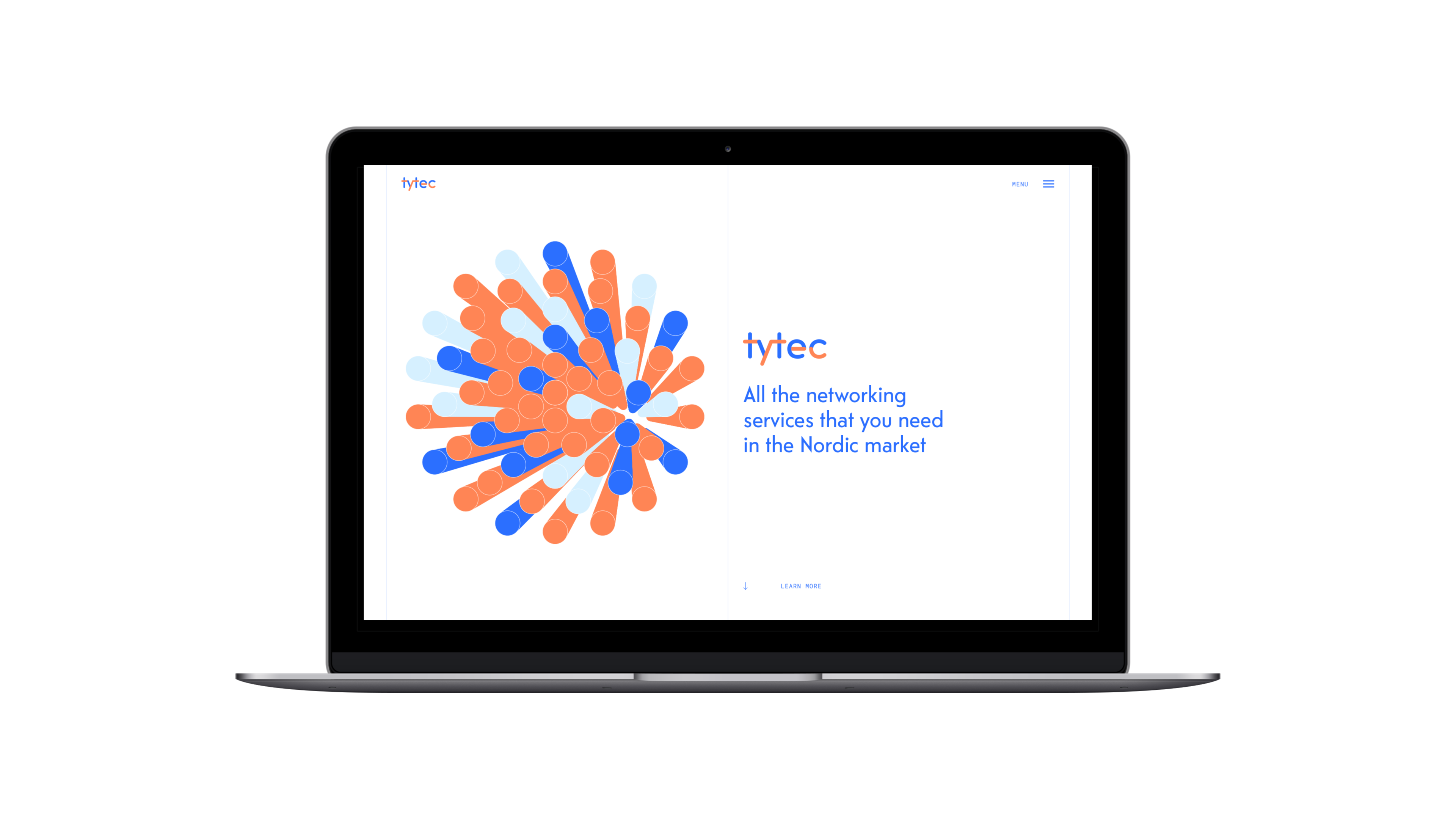
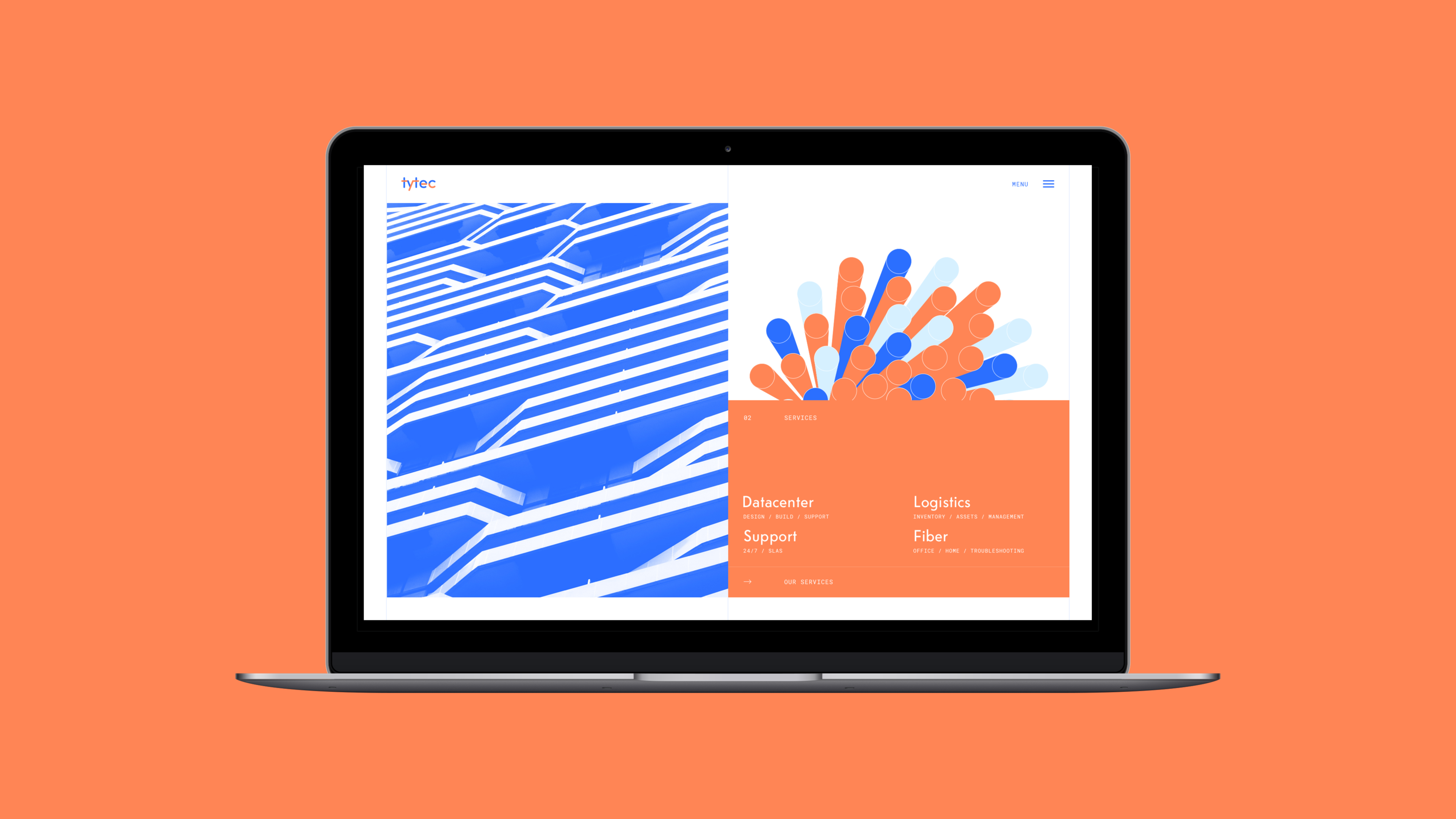
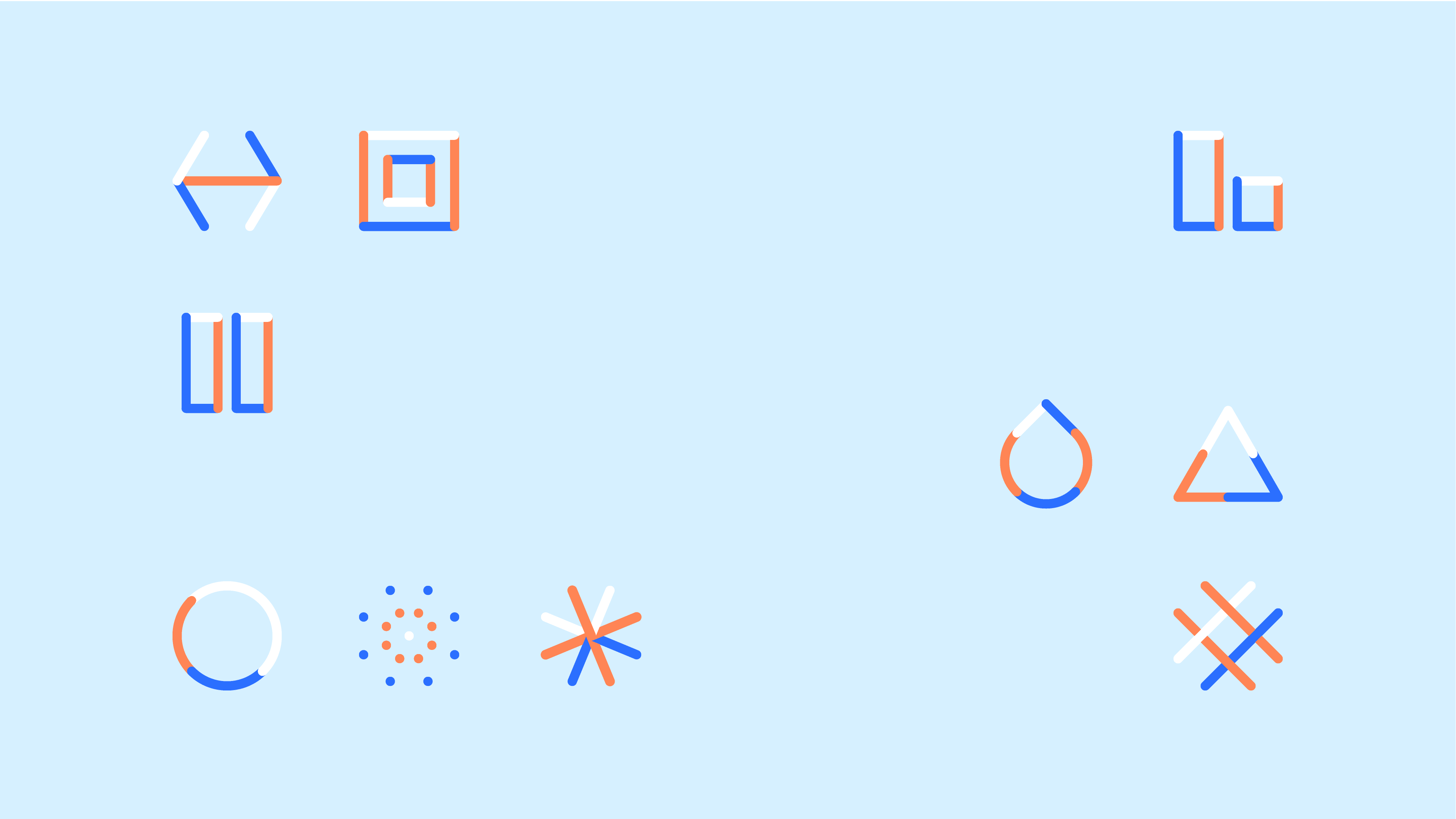
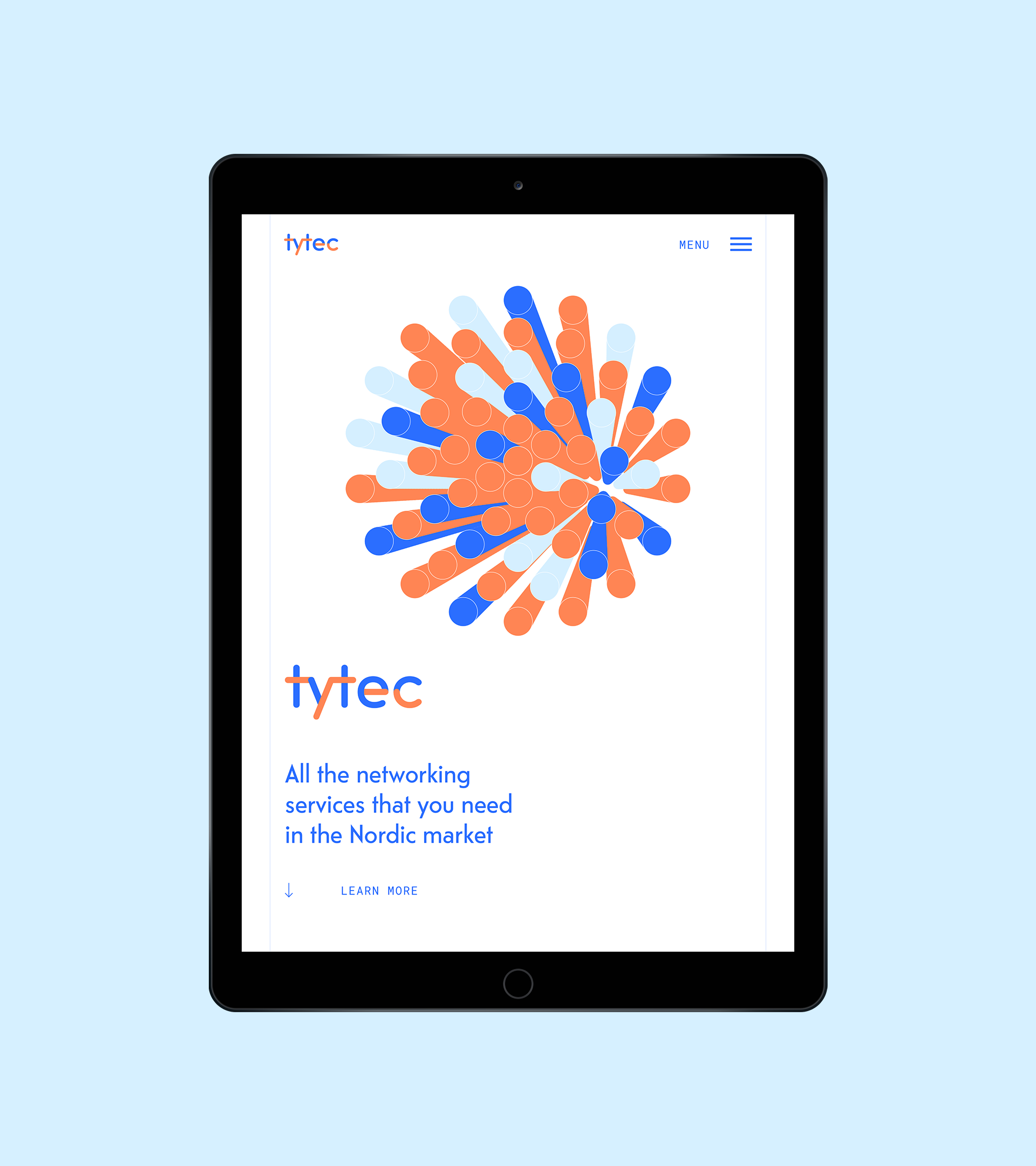
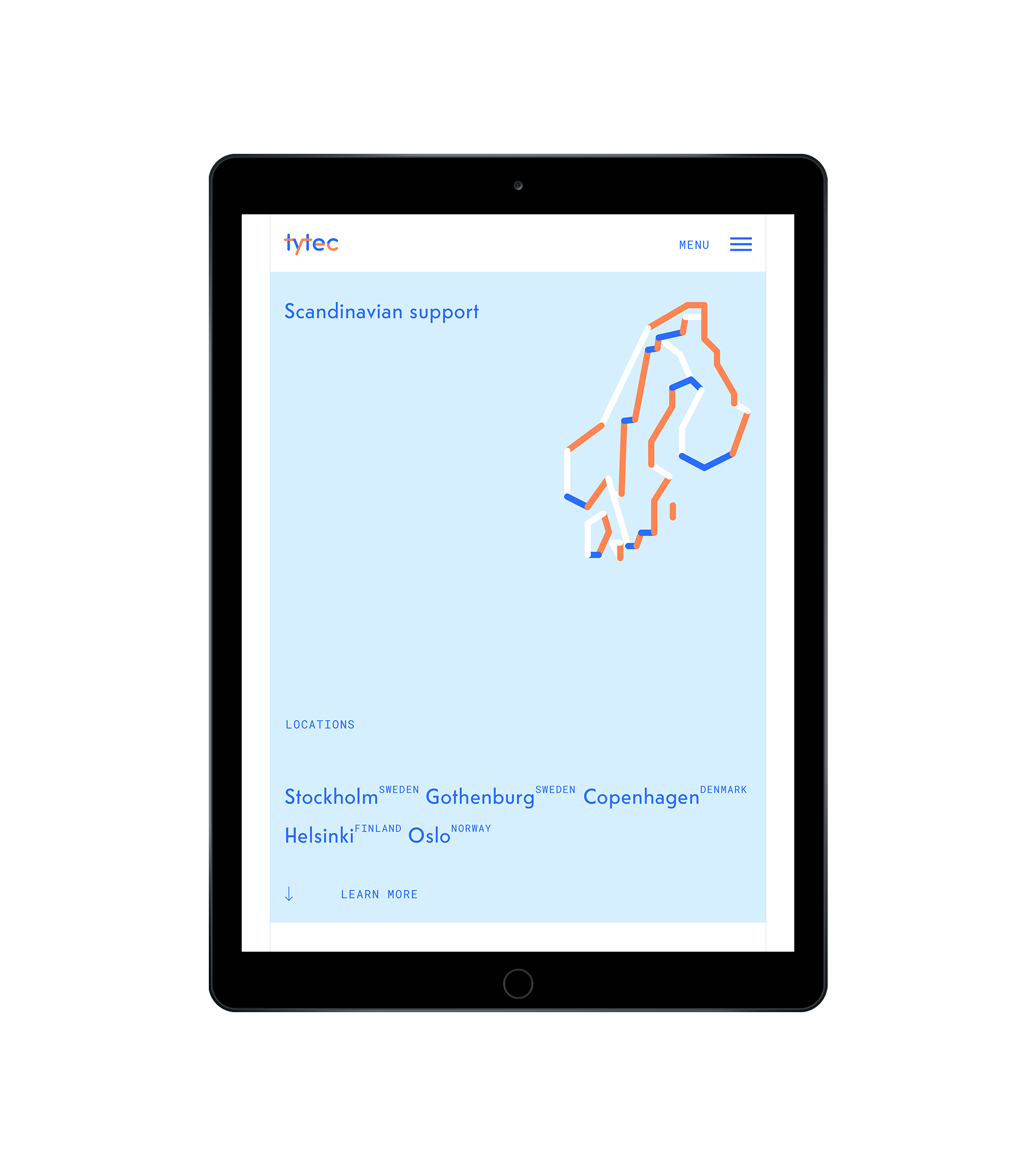
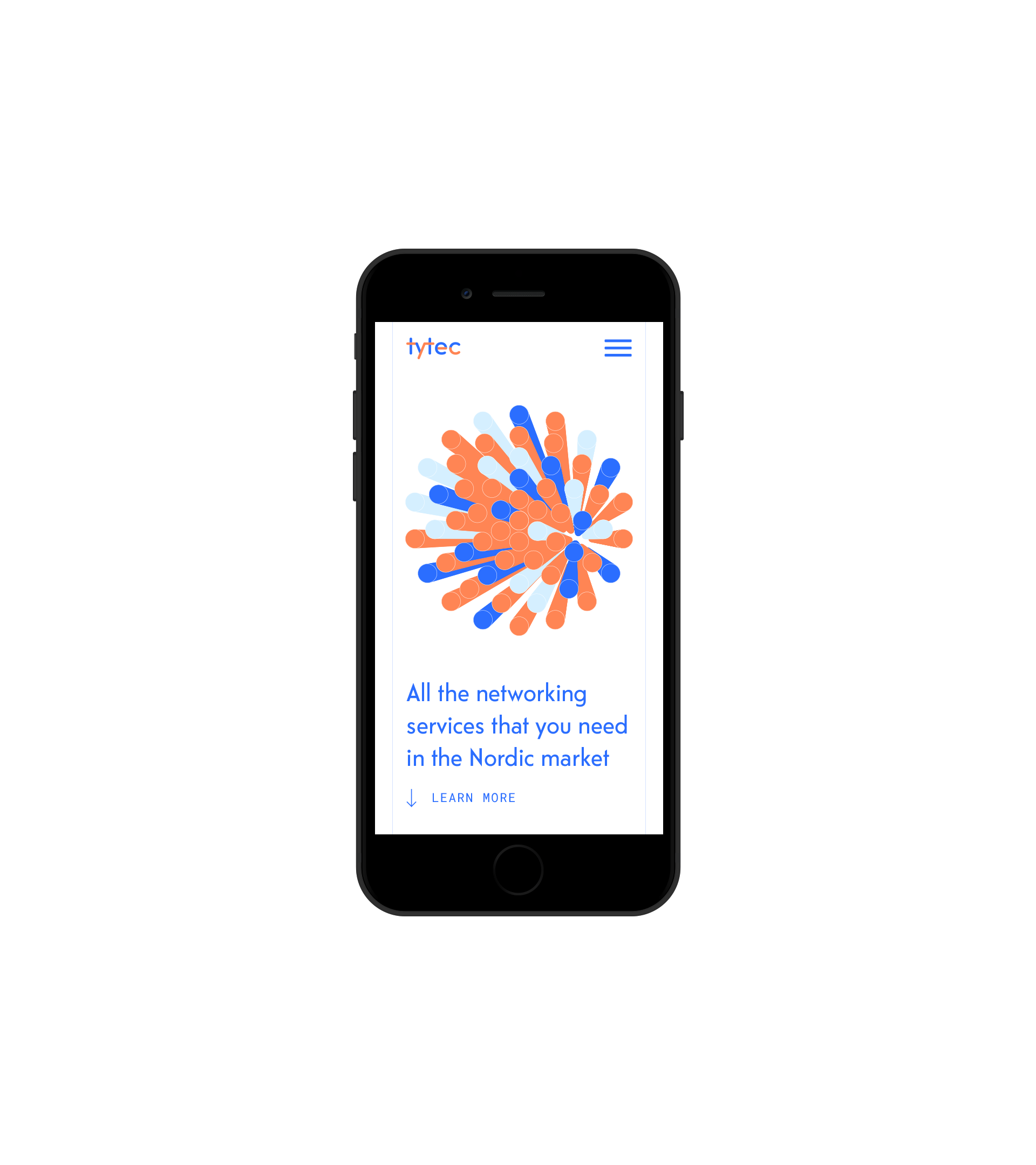
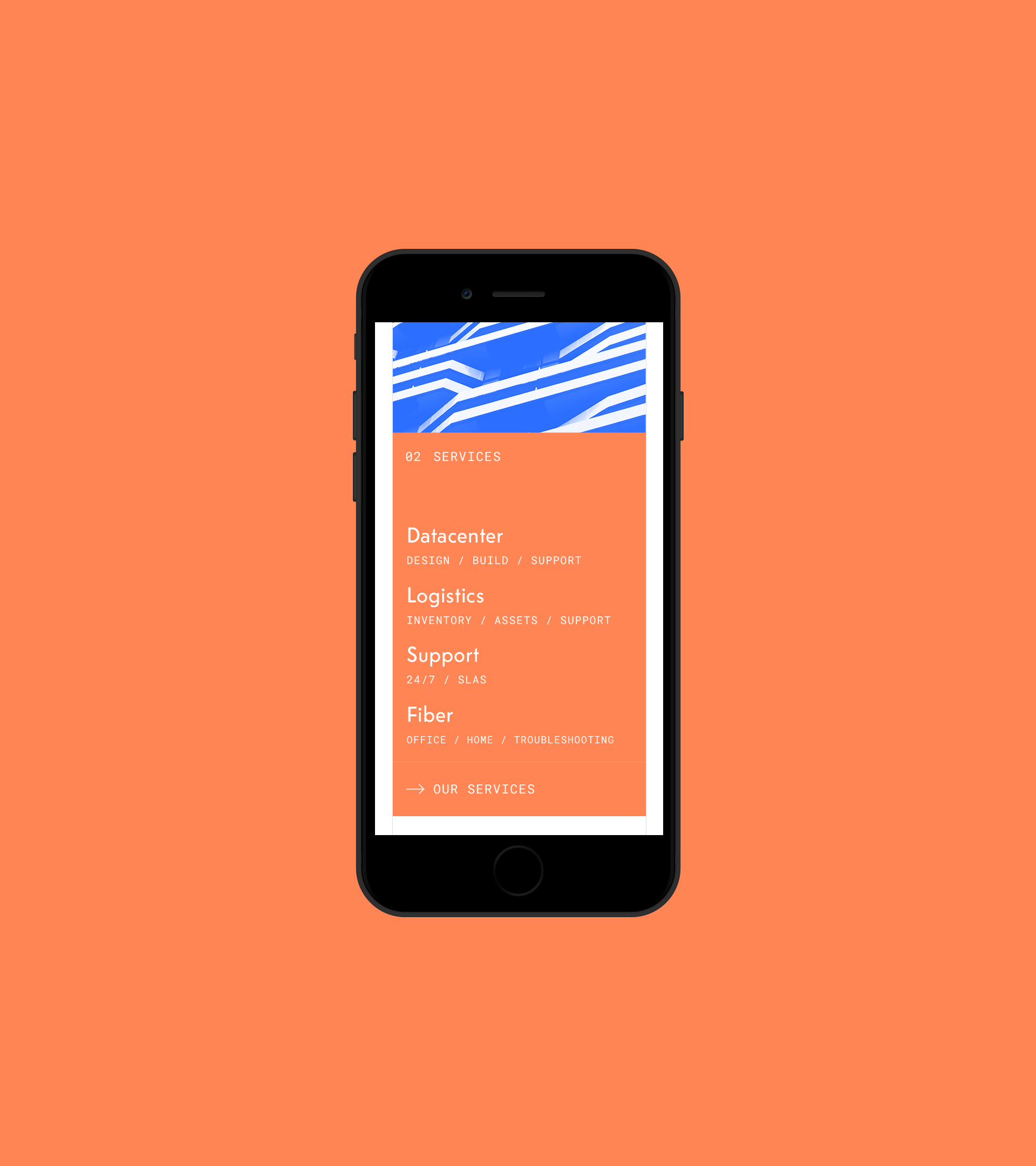
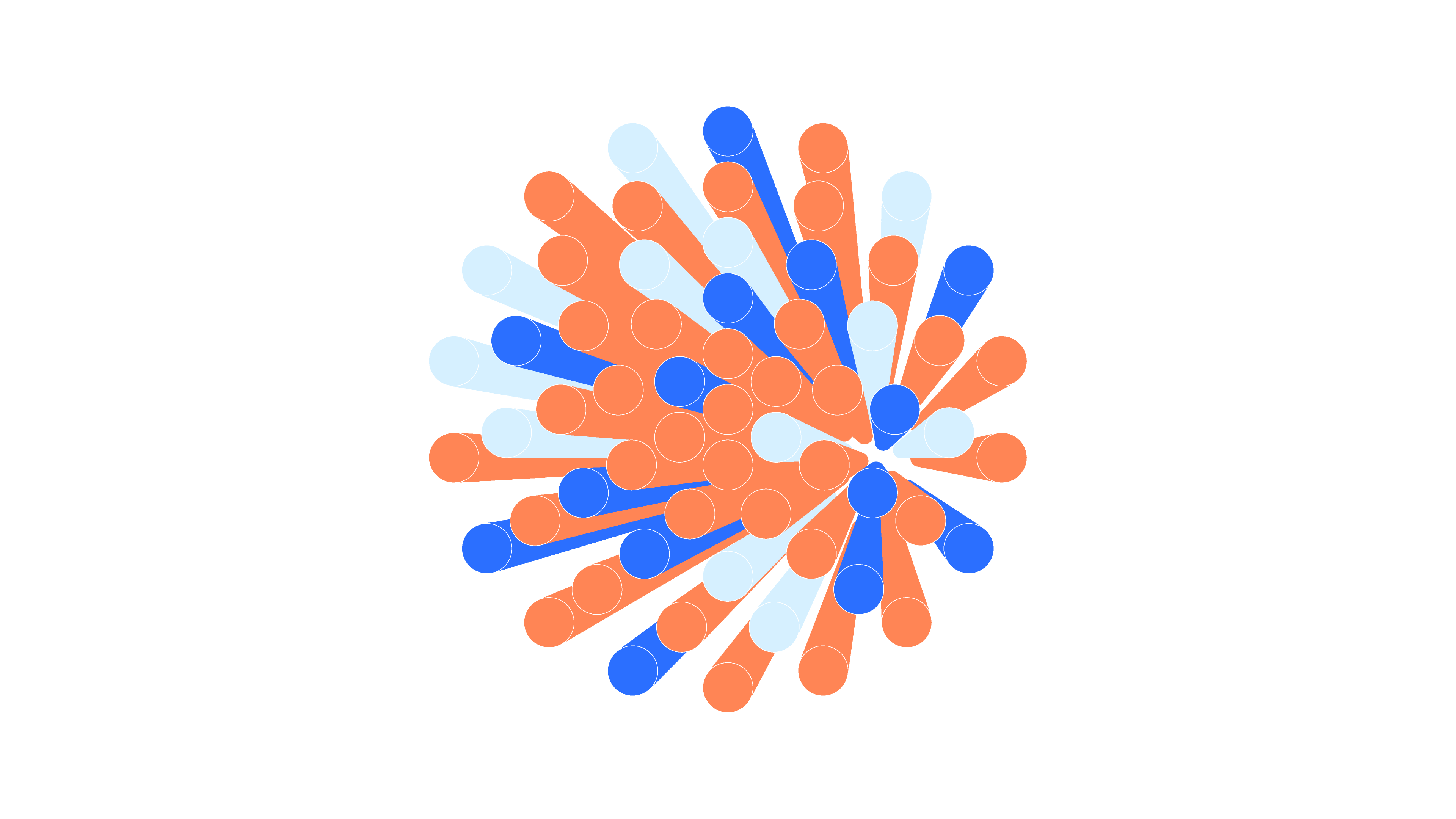
We searched for visually appealing forms in shapes, typography and colours. What we finally came up with was a gorgeous combination of a bunch of wires with a typeface inspired by the lettering from the iconic Norwegian telephone booths.
Output
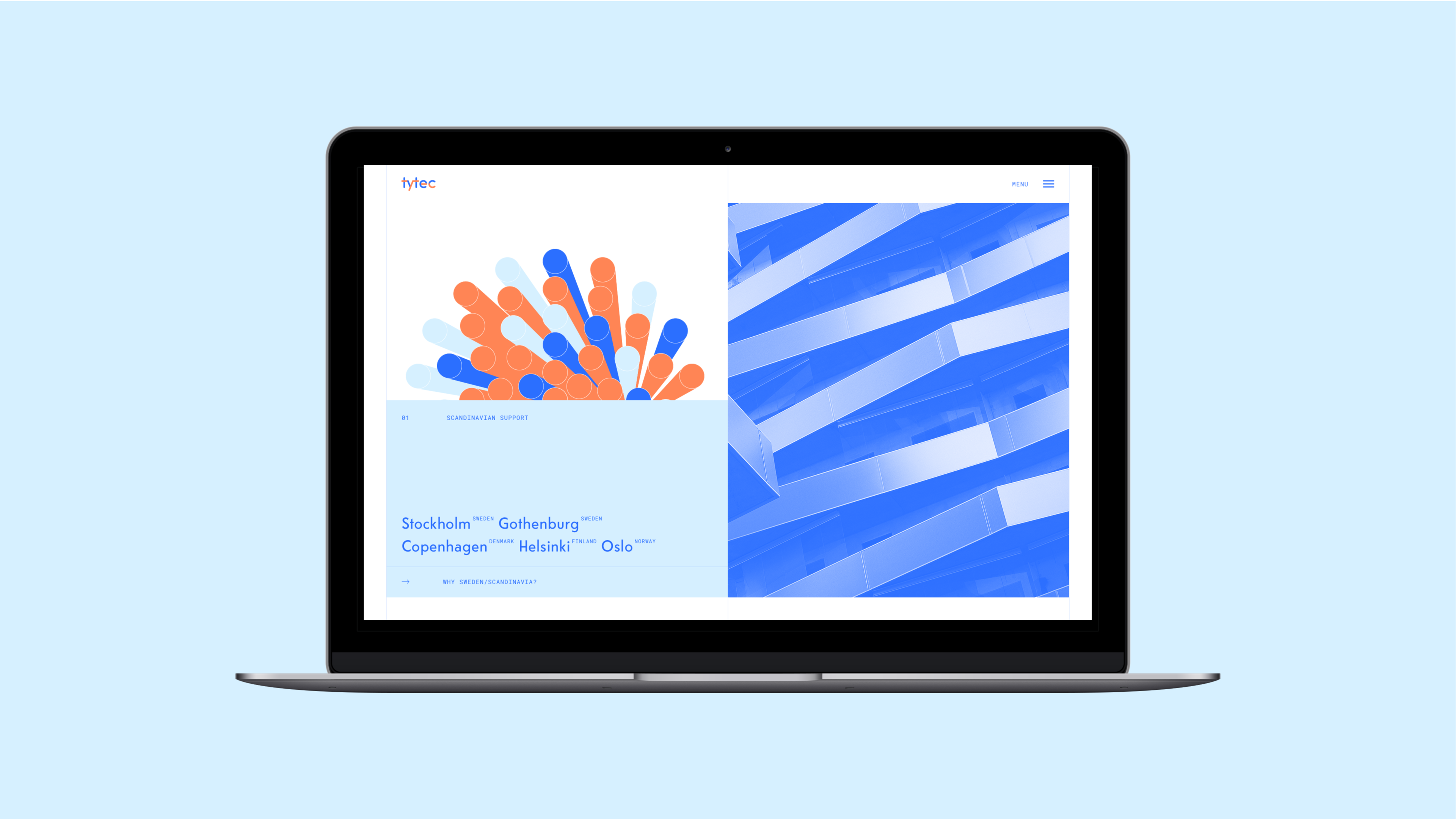
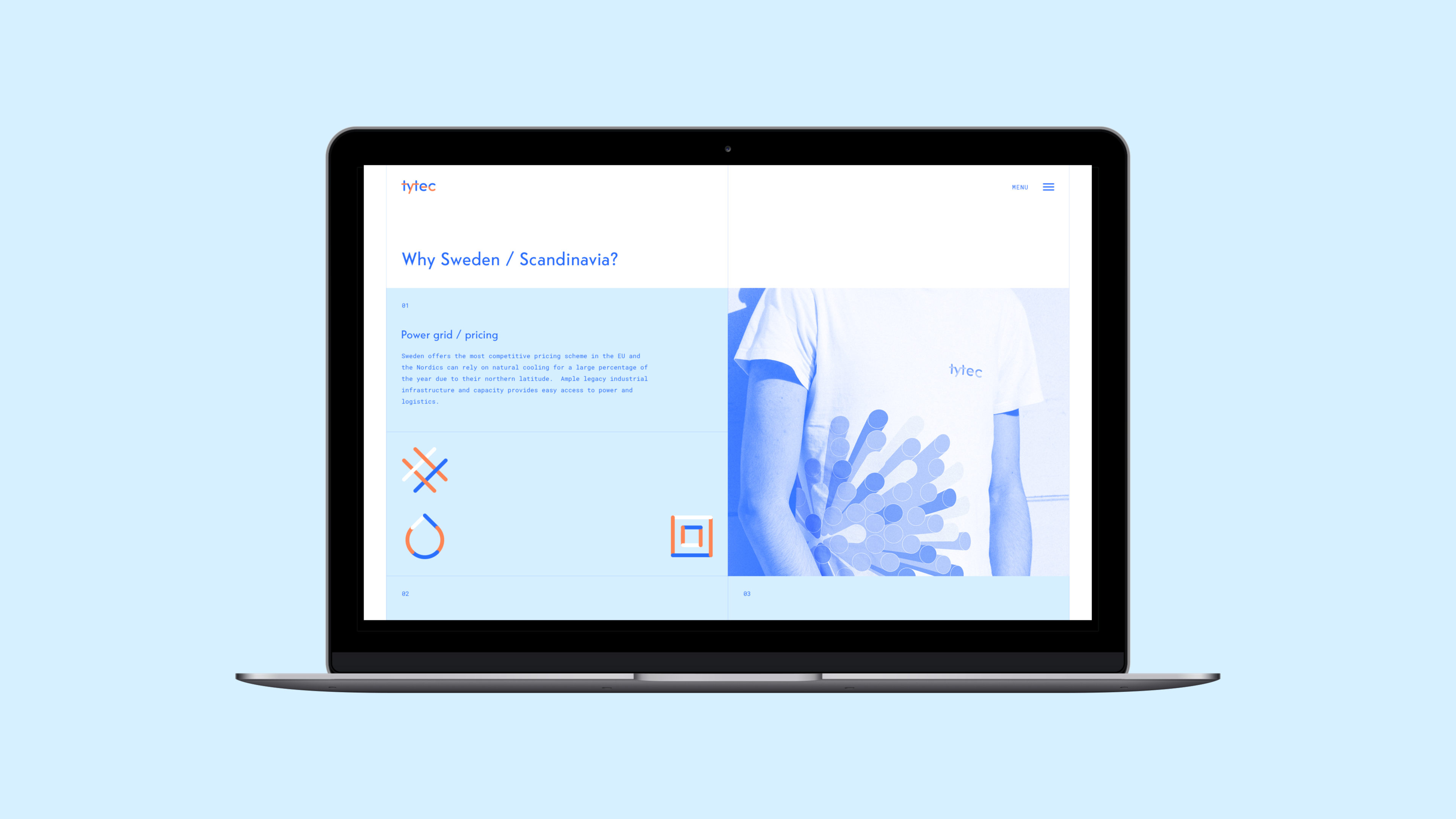
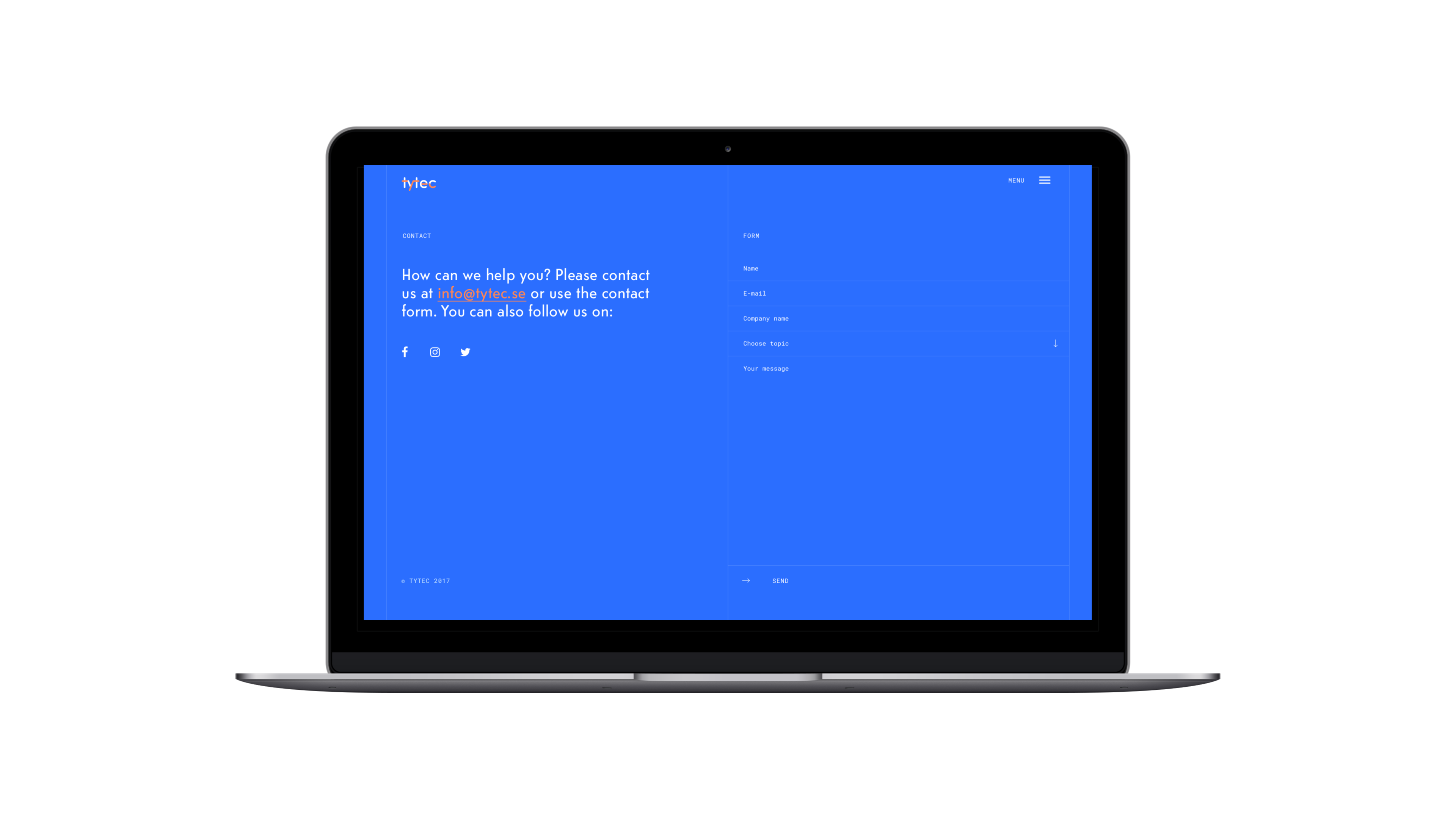
The result of our work was a distinctive logotype and an appealing brand identity emphasising the company’s professional attitude.
